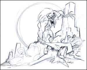
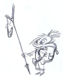
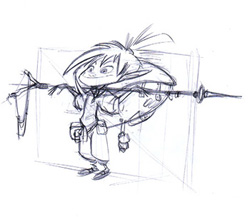
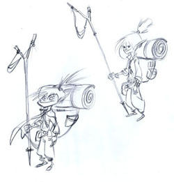
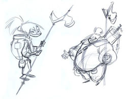
Something to cure the lull in my posts. Still working hard on the Tasslhoff clean up and model sheet. Until then this will have to do. Been doing a lot of muscle studies and wanted to put them to use.
-Craig
Wednesday, June 30, 2010
Sunday, June 27, 2010

immediately after posting i noticed one issue that I really had with the image and wanted to resolve. the original drawing was more successful in having the appropriate depth in conan's arm, as noted. the lines that I used to describe the form did a poor job providing the perspective that i wanted. the quick fix for this is below.


here is the refined conan image. i have to tried to keep in mind some of the things that i had mentioned im my last post. a big step for me is remaining mindful of this information as i draw so that it becomes second nature.

here is a side by side of the two images. i made an effort to make the second image better than the first by making conscious decisions.

i do think that the greatest improvement between the two is the flow of the refined piece. it seems to move better and the more dramatic diagonals add to the drama of the piece. i believe the hips in the refined piece are also a bit more figured out. there are still some issues that need resolution.
Wednesday, June 23, 2010

so i decided that i needed an image to do just for the sake of fun and learning. there are quite a few concepts that i need to become familiar with in order to design successful characters. i decided to work with something like Conan because there are a couple elements that Conan could help me with.
For starters, the signal to noise ratio is good. meaning, he has big broad features that define his character. there isnt a whole lot there that doesnt need to be. we know who he is and what he does with a minimal amount of detail. secondly, this provides me the opportunity to not have to actually design the character but still figure out why he works as a character and identify if i can make a successful drawing.
I had a lot of fun turning my brain off and working in a style, and with shapes, that I am unfamiliar with. sure it has its problems right off the bat but i am less concerned with them as i am with identifying them.

so to begin by breaking it down. the red lines identify areas where i believe the design fell asleep. aside from the problems with the perspective/foreshortening, the weight distribution seemed a bit off. also, the calves were not interesting enough to carry the bottom half of the drawing.
I began to question, was there enough variety of shape? were they fun to look at? can i take it farther?

the next step in my head was to identify whether or not there was a clear underlying structure. although the anatomy has been stretched i have a desire to make it believable. did the structure underneath have a basis in reality? although the "skeleton" was quickly sketched in i can deduce that while there is some form of anatomy there were also some places where the anatomy gets away from me. again, the legs were an immediate source of problems, stemming from my lack of knowledge of the hip.

i begin to ask myself, is the design too complicated? can i successfully abstract the image and shapes and still convey a clear message. if the fat is trimmed, is the story still there? do we still have a violent looking beast of a man? I sketched in a very basic simplification of the drawing. the angles are still there, the movement. is this a more successful drawing?

when thinking about the image in the state of pure shape i began to question whether or not this shape allows for proper eye travel at all. at a very basic level, can the viewer decipher what is going on and as the artist, can i direct traffic to the area of greatest importance. the blue lines that i have drawn in represent the path of travel that my eye was taking throughout the image. there are areas where the travel stays within a point of interest. however, there are a few areas where you are forced out of the image, or become lost in the movement.
as i understand it, composition and your ability to move the viewer through the image should be handled like the careful construction of a highway. too few lanes and you dont allow for proper movement, too many and you invite reckless behavior.
this image could definitely be improved.

this final image was another step in process. some of the composition elements are a little resolved but the actual point of the image refers back to the second image in the series. did i go far enough? how far is too far. can this work?
naturally, there are still problems with this image but the point is not to have it perfect yet. the point was to ask myself: how far can i continue to go? even when i think i have hit it over the fence, can i take it farther? i feel that i could draw this image 30 times and continue to refine and take it farther and farther. but should i?
of course there is a line, but its a fine one. I believe that line is one that only i can define for myself. intuition will draw it out for me.
Sunday, June 20, 2010

big issues for me this week. after drawing the goblin king over and over all week, trying to get a decent drawing, i decided that i absolutely hate the design that i had working with him. I have decided to completely start the goblin king design over from scratch. This is just a drawing to shake the cobwebs out. thought about going another direction entirely. more to be uploaded tomorrow.
Sunday, June 13, 2010

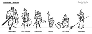
a bit rough but a start i suppose. there is obviously a very large cast of characters from this movie. these are just some of the more important characters and the ones that I believe offer the greatest shape varieties. this gives me a point to begin refining from.

cleaning up in photoshop is way too clunky for me given my certain setup. should do it on paper.
Friday, June 11, 2010
Dragonlance Chronicles Character Layout
Hey Chris,
The established property here is from a series of books called the Dragonlance Chronicles. I just realized I need to add the girl Tika. She is a pretty integral part of the group here. I will add them before the weekend is up.
-Craig
The established property here is from a series of books called the Dragonlance Chronicles. I just realized I need to add the girl Tika. She is a pretty integral part of the group here. I will add them before the weekend is up.
-Craig
Monday, June 7, 2010
Tasslehoff Burrfoot Round 1
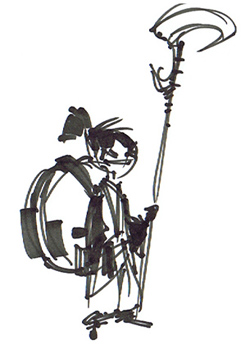
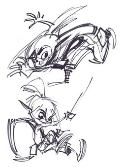
Chris, this is my first pass for Tasslehoff Burrfoot from the Dragonlance Chronicles. I may try a less stylized version as well. Lets stick to one character a week. That is more than enough I think. Next week lets be sure to have nice pages put together that can actually be placed in our folios.
-Craig
Sunday, June 6, 2010
Saturday, June 5, 2010
Subscribe to:
Comments (Atom)
